System Fonts are Good for Accessibility, Like Really
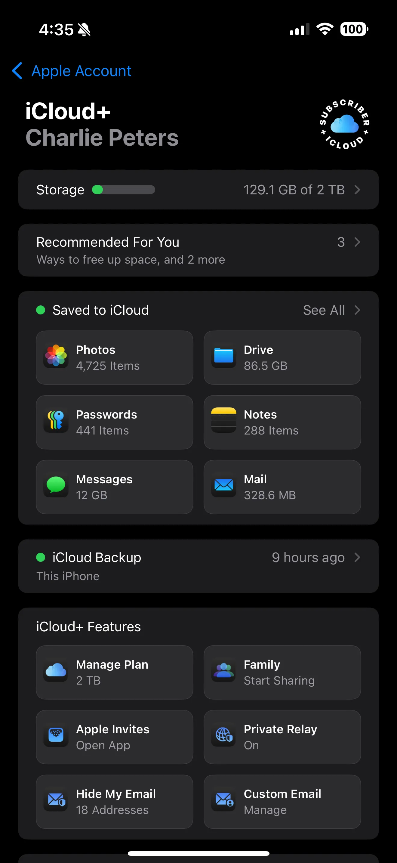
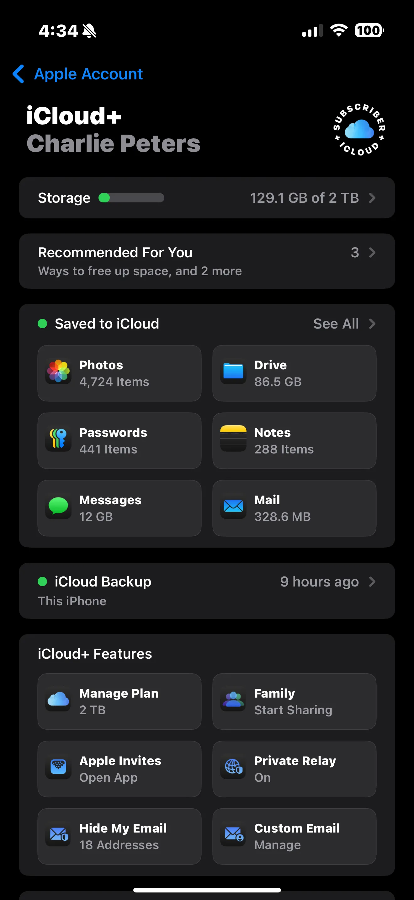
In iOS, there’s this setting in Settings > Accessibility > Display & Text Size > Bold Text, I have it turned on all the time and I really wish it was available on macOS. My eyesight refuses to be what it was a decade ago and now looking at thin type is more and more difficult. But this little setting turns everything a little bit bolder, even the stuff that was already bold.
Take a second — try it.

versus

Built-in to every system font that Apple releases, San Francisco (the sans serif) and New York (the serif) have this little switch in them that make them a little bolder when this setting is on, even the heaviest weights. Even the width variants for San Francisco (expanded, compressed and condensed) have this feature.
When you use custom fonts, you have to detect this setting in your application code and switch weights accordingly. The Twitter app built this in when they adopted the Chirp font (I don’t know if the X team cares about accessibility that much). But that’s the only real example I can think of using custom fonts.
On the web, CSS doesn’t have a media query yet to detect this accessibility preference like it has for reduce motion. JavaScript doesn’t have a way to detect it either. But fun thing in CSS, you can literally just use ui-sans-serif or ui-serif to get the system font and Safari even accepts ui-rounded to get the rounded version of the system font.
So next time, you’re reaching for a custom font, maybe skip it? Maybe?